Madre Cuenca —
Wants you
Healthy
Overview
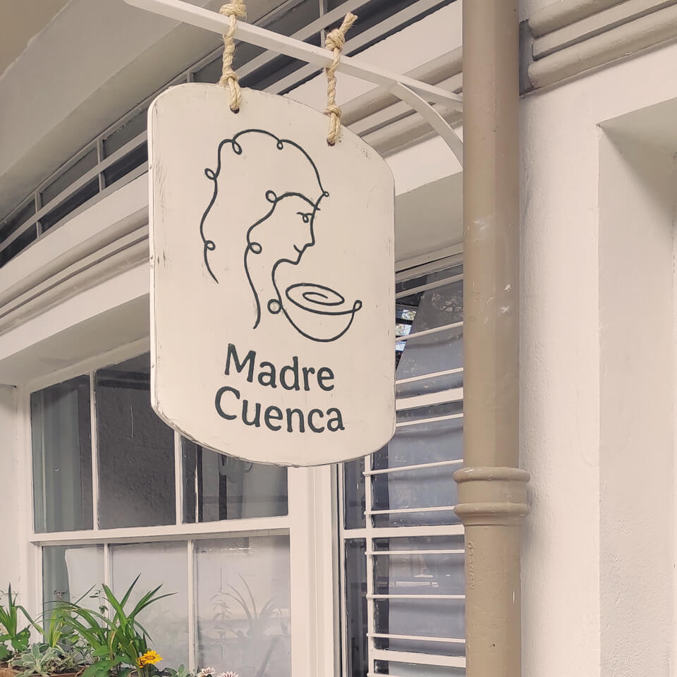
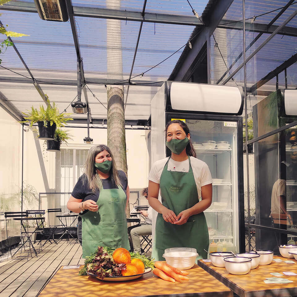
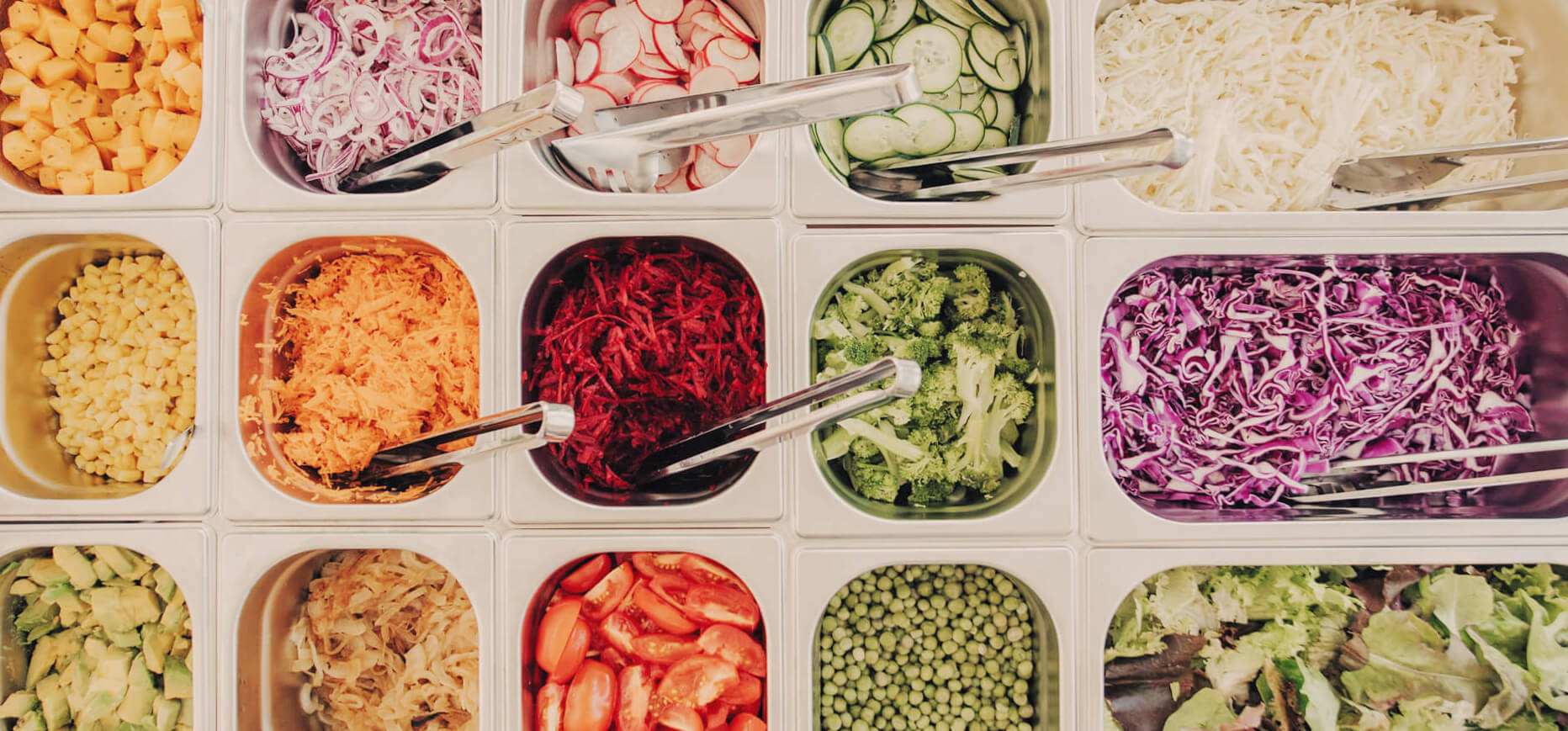
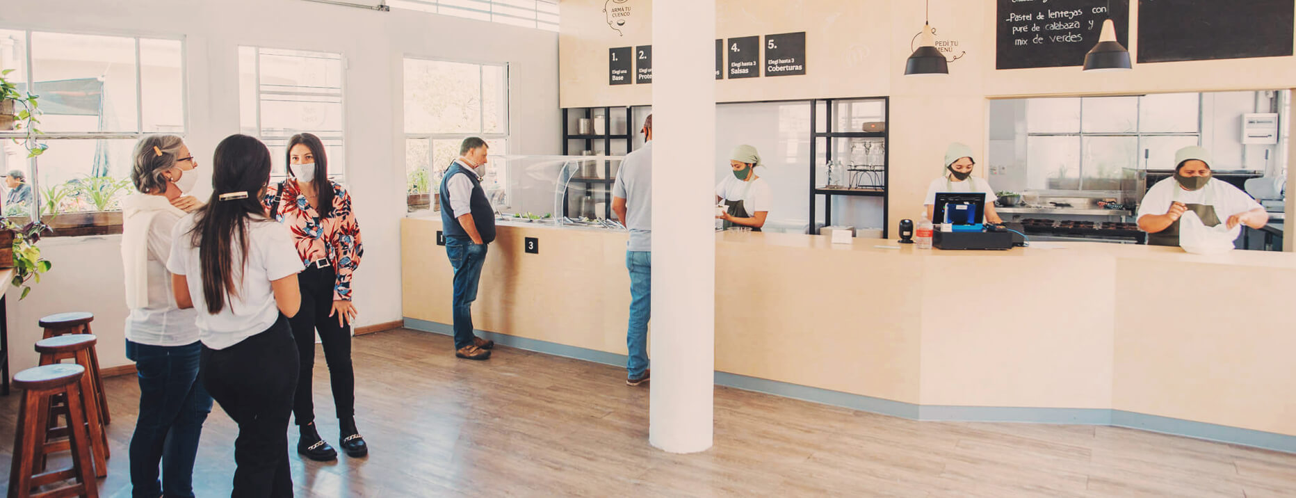
Madre Cuenca emerged in a historical place within the iconic municipal food market of the city, which was originally founded in 1941 by mothers, with the help of the city's hospital investment.
In such context and completely aligned with the original intention, we were approached to create a visual identity for a familiar food business that promotes the transition towards a healthier and more sustainable food system.
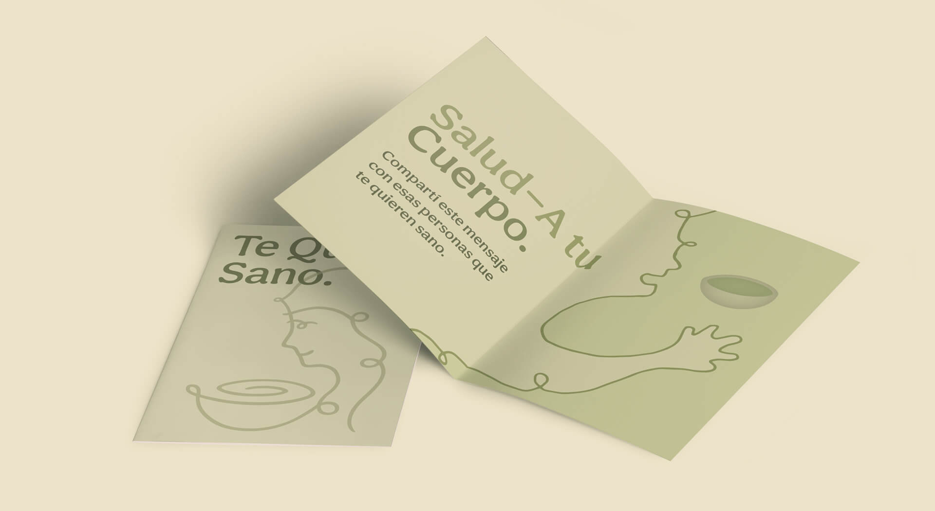
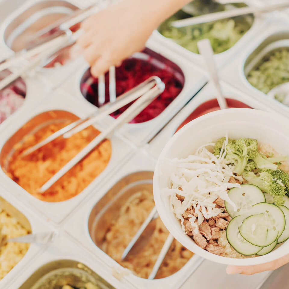
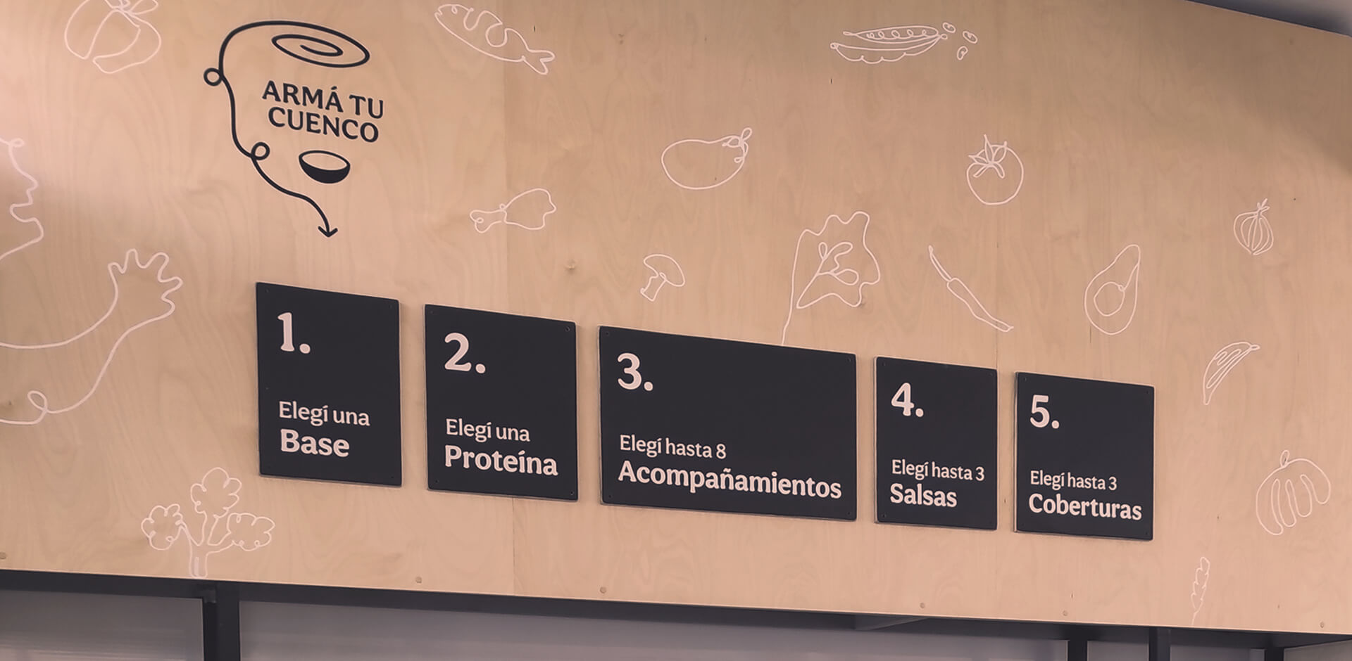
The strategy was mainly centered on the relation of mother-son essential health caring. A concept that represents a faithful, loyal and holistic approach to nutrition, where local organic production prevails respecting natural processes, the land, and local fair exchange.
Services
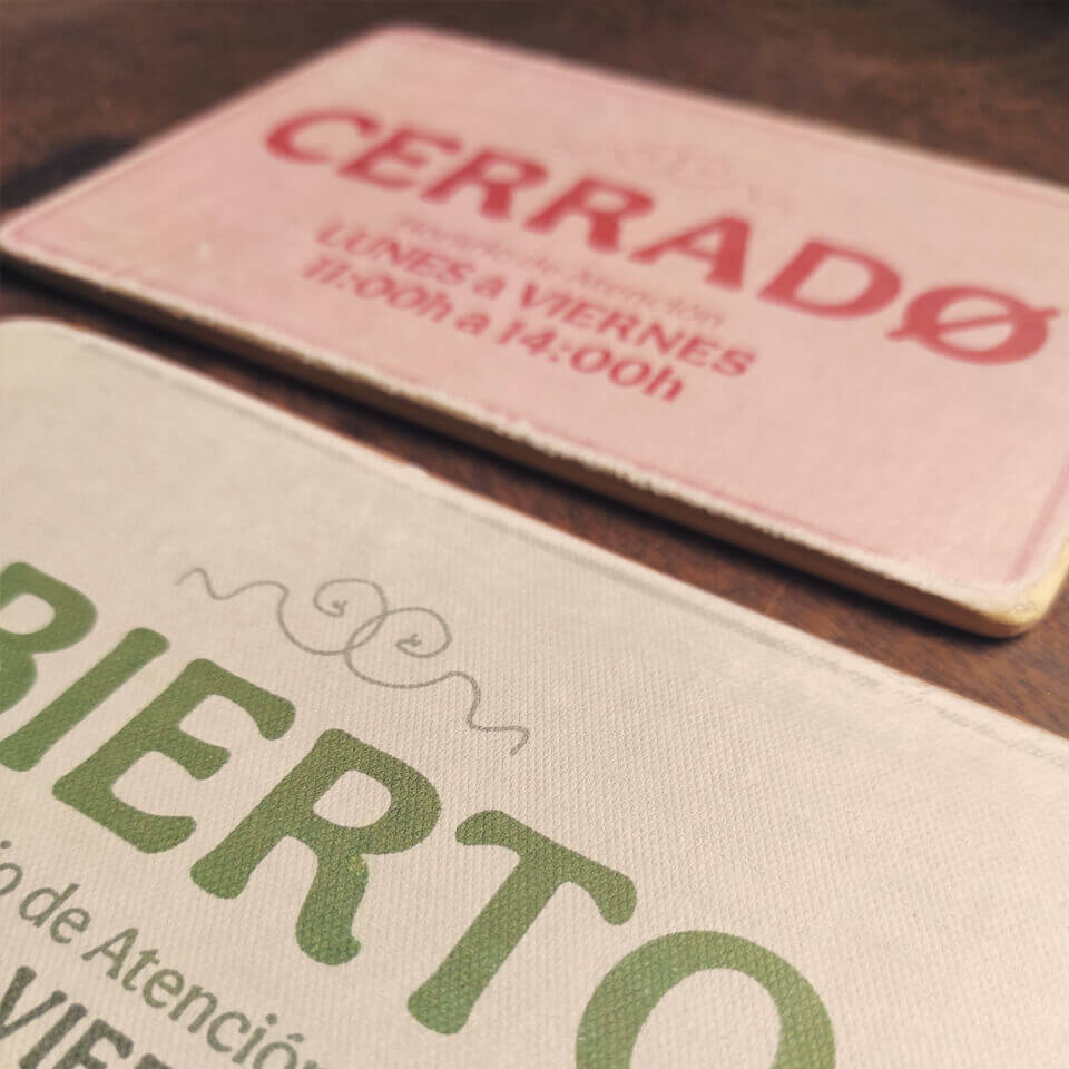
Brand System
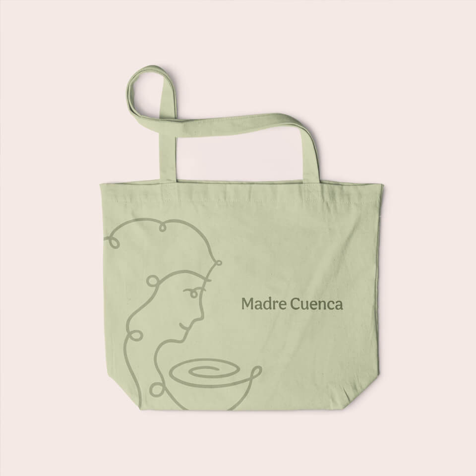
Name Creation
Typographic Style
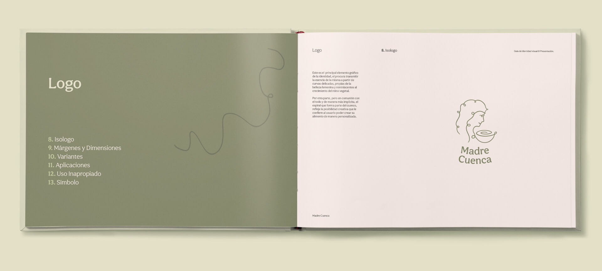
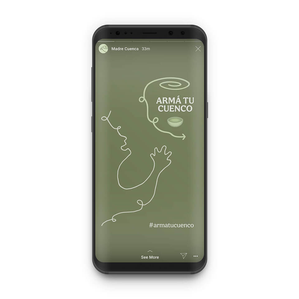
Logotype/Symbol
Icons/Graphics
Color Palette
Illustrations
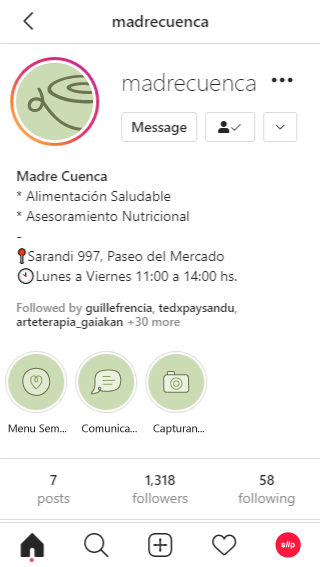
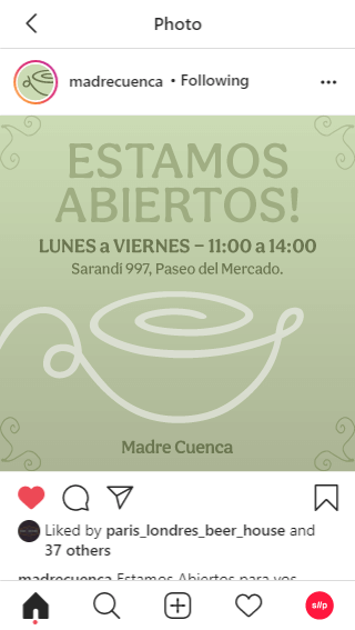
Social Templates
Copywriting
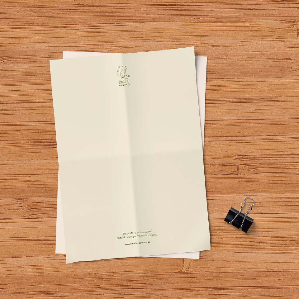
Packaging
Print
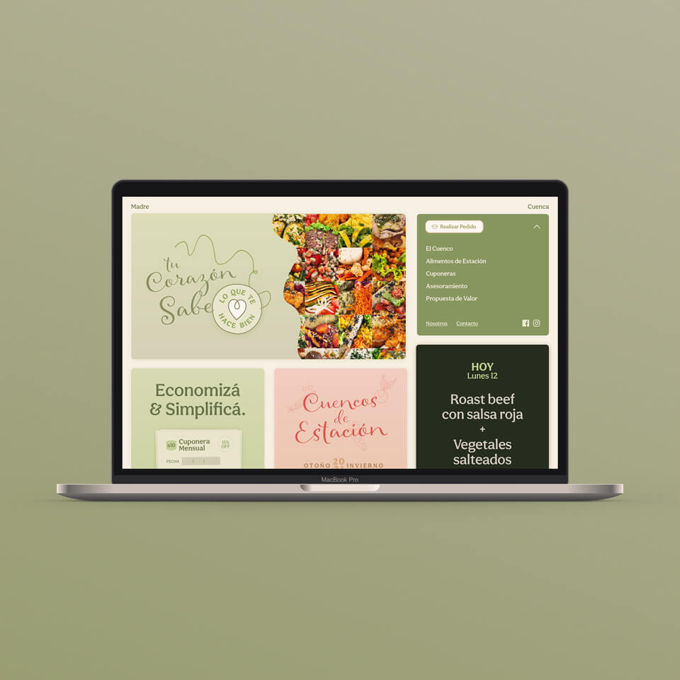
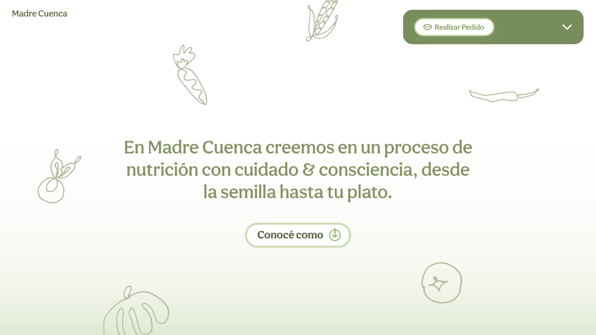
Web Solution
Information Architecture
UX/UI Design
Responsive Web Coding
Development
Interactive animations
Credits


Facundo Moyano
Leonardo Moyano
Dahiana Rocha
Stephan Heit
Jean-Paul Massonnier
Agustina Venzano
Ismael Estefanell

Work Archive
-
PPBEA - Workable Learning
-
Planetary - Socially Personal
-
Rooster - Revolutionary Spirit
-
TEDx Paysandú - Reinvent Ourselves
-
UTEC EDU - Digital Academic Education
-
Arkontes - A Real Estate
-
London & Paris - Singular Match at Law
-
Azendeu - Expression of Freedom
-
Honis - Ensure Transparency
-
Weik - Home of Joy
-
Oxend - Green Hearted Couriers
-
Via21 - Collective for Good
-
THE RANDOM FEED